S.H.E Foundation
Strength. Hope.
Empowerment.
An identity with people at its heart.
In collaboration with
Three words.
One expressive mark.
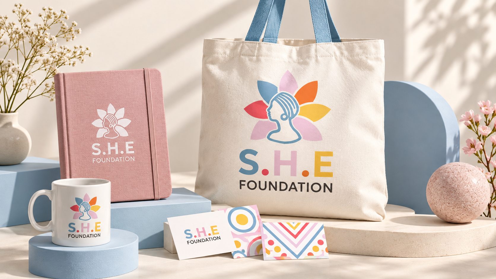
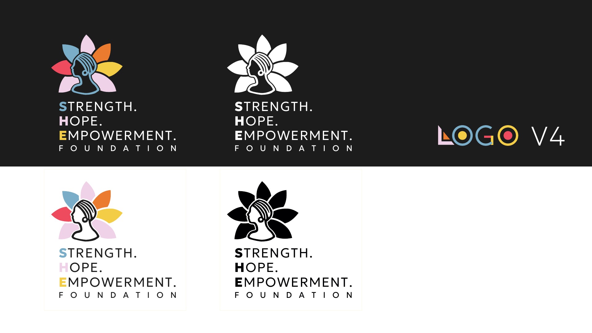
The identity brings the foundation’s name to life through three words: Strength, Hope and Empowerment. A woman’s profile sits at the centre of a colourful, petal-shaped emblem.
The final-logo presentation develops that idea into a flexible family of marks, combining the full name with compact S.H.E Foundation versions.
A palette full
of possibility.
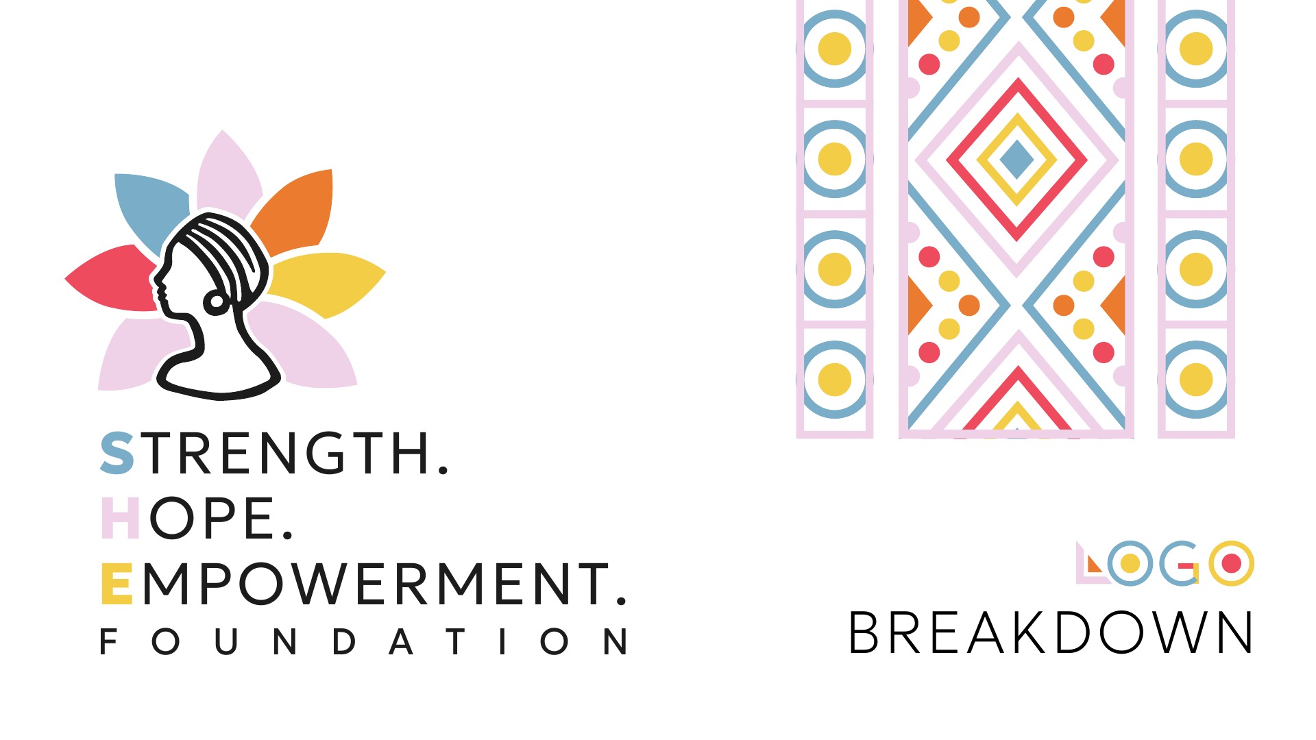
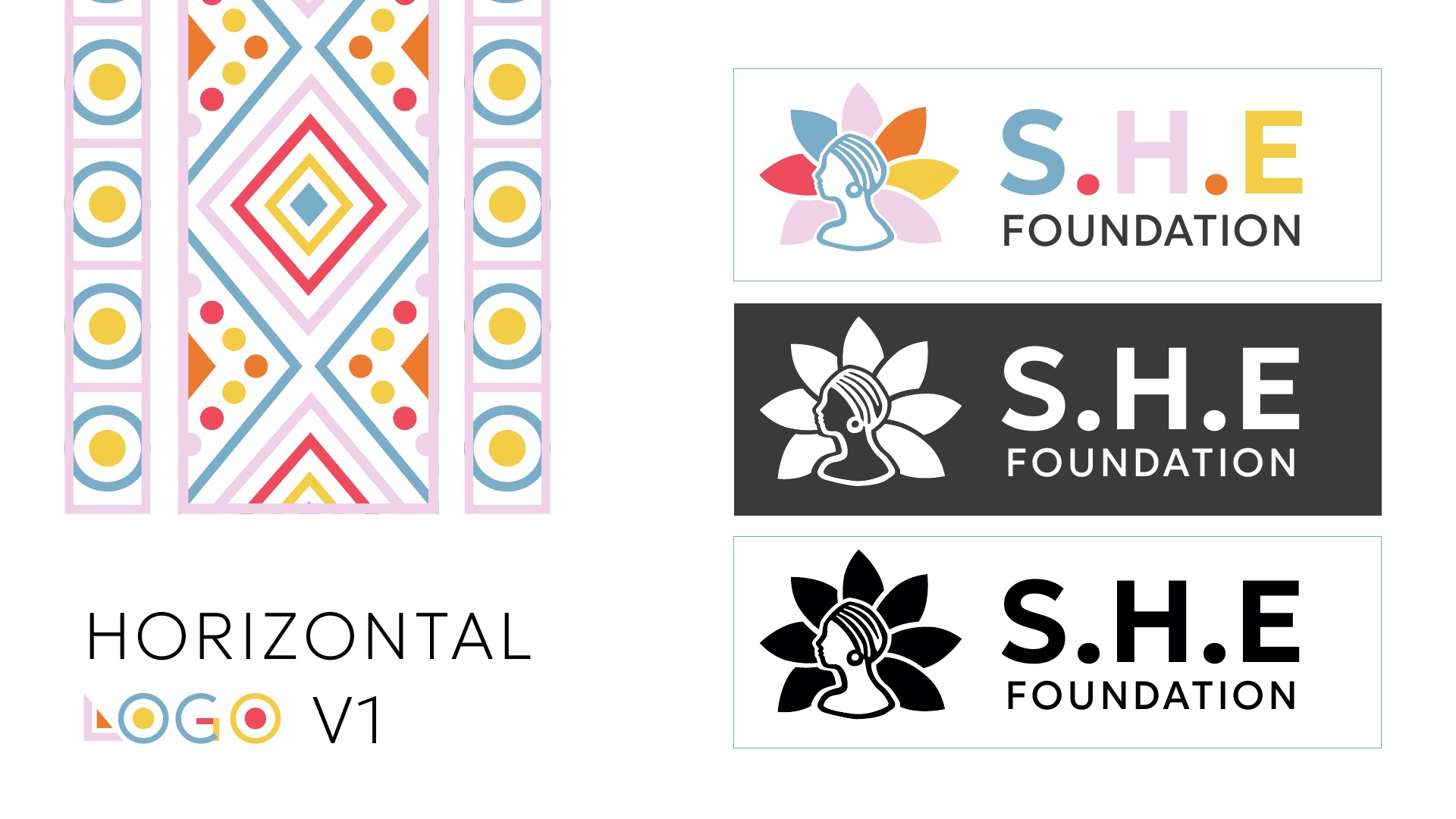
Blue, pink, yellow, coral and orange give the identity a varied, expressive voice. White and dark backgrounds offer different ways to bring the colourful mark into focus.
Room to adapt.
Always recognisable.
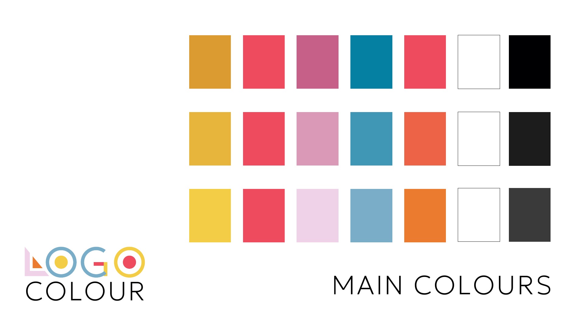
Vertical and horizontal arrangements give the identity different proportions for different spaces. The abbreviated name provides a compact option, while the full wording makes the foundation’s name explicit.
Full-colour, white and black variations are shown together in the presentation, with the profile and petals providing a consistent visual connection.
Beyond
the logo.
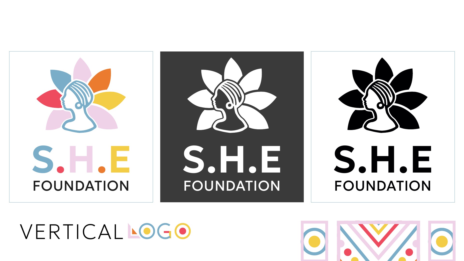
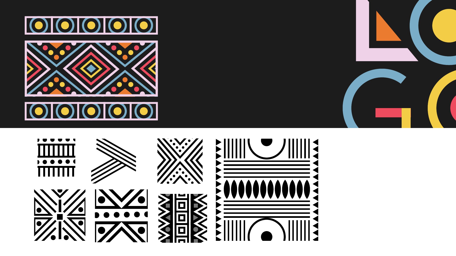
Diamonds, circles, lines and repeated shapes extend the identity into a decorative graphic language. The presentation explores colourful and monochrome pattern directions alongside the core mark.
Together, the logo family, palette and patterns create a foundation for consistent future communications.
Made to be part
of everyday life.
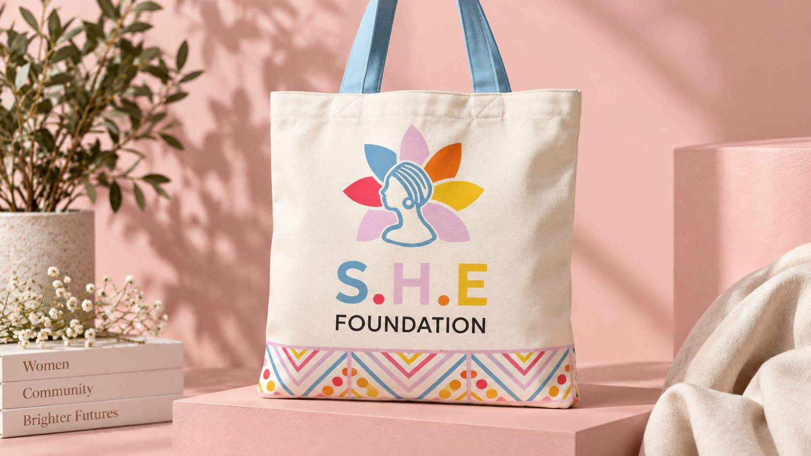
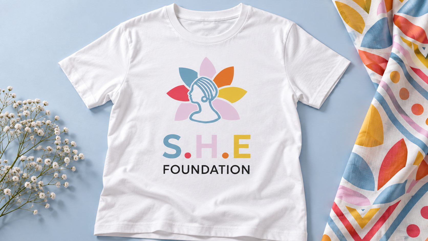
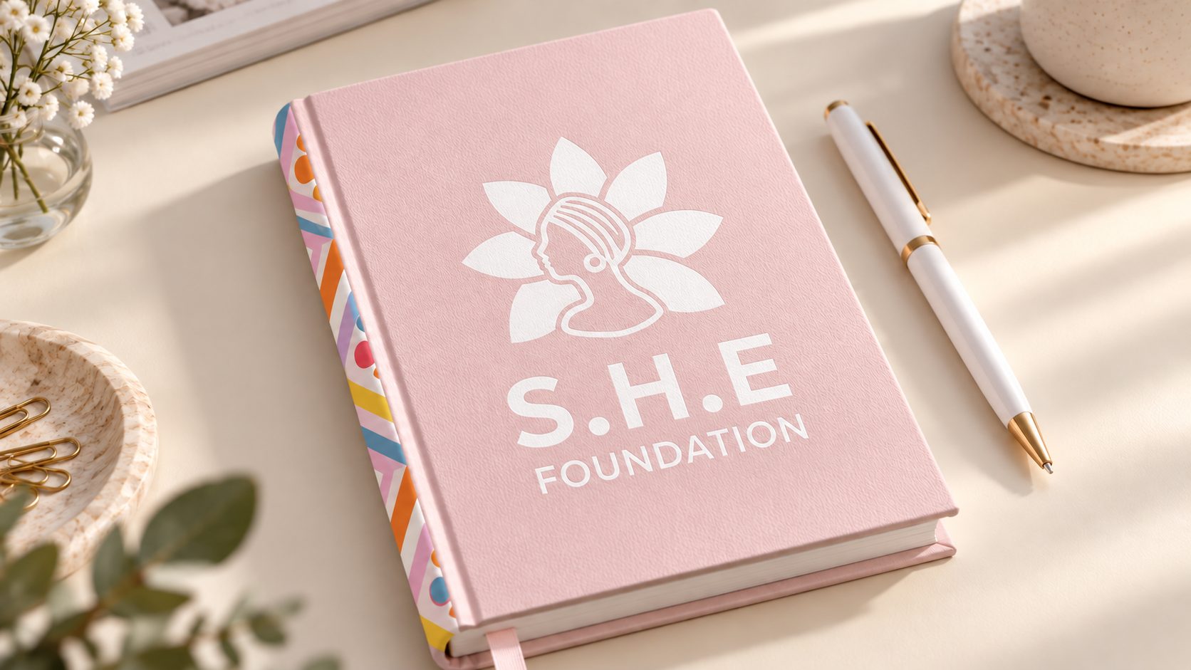
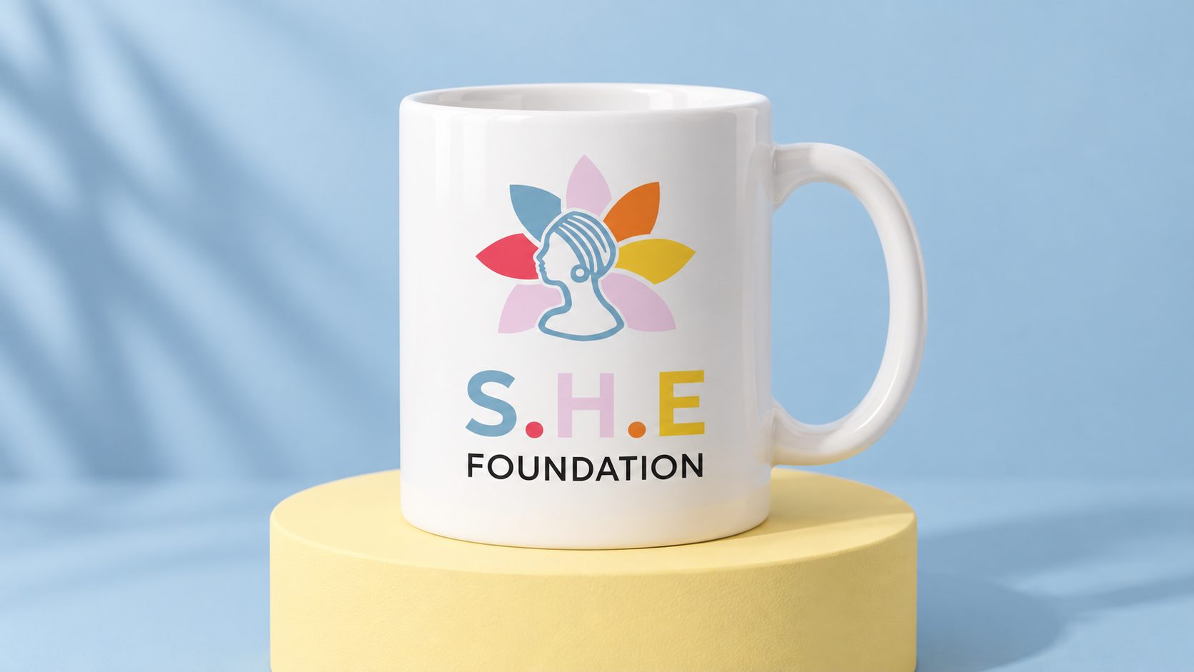
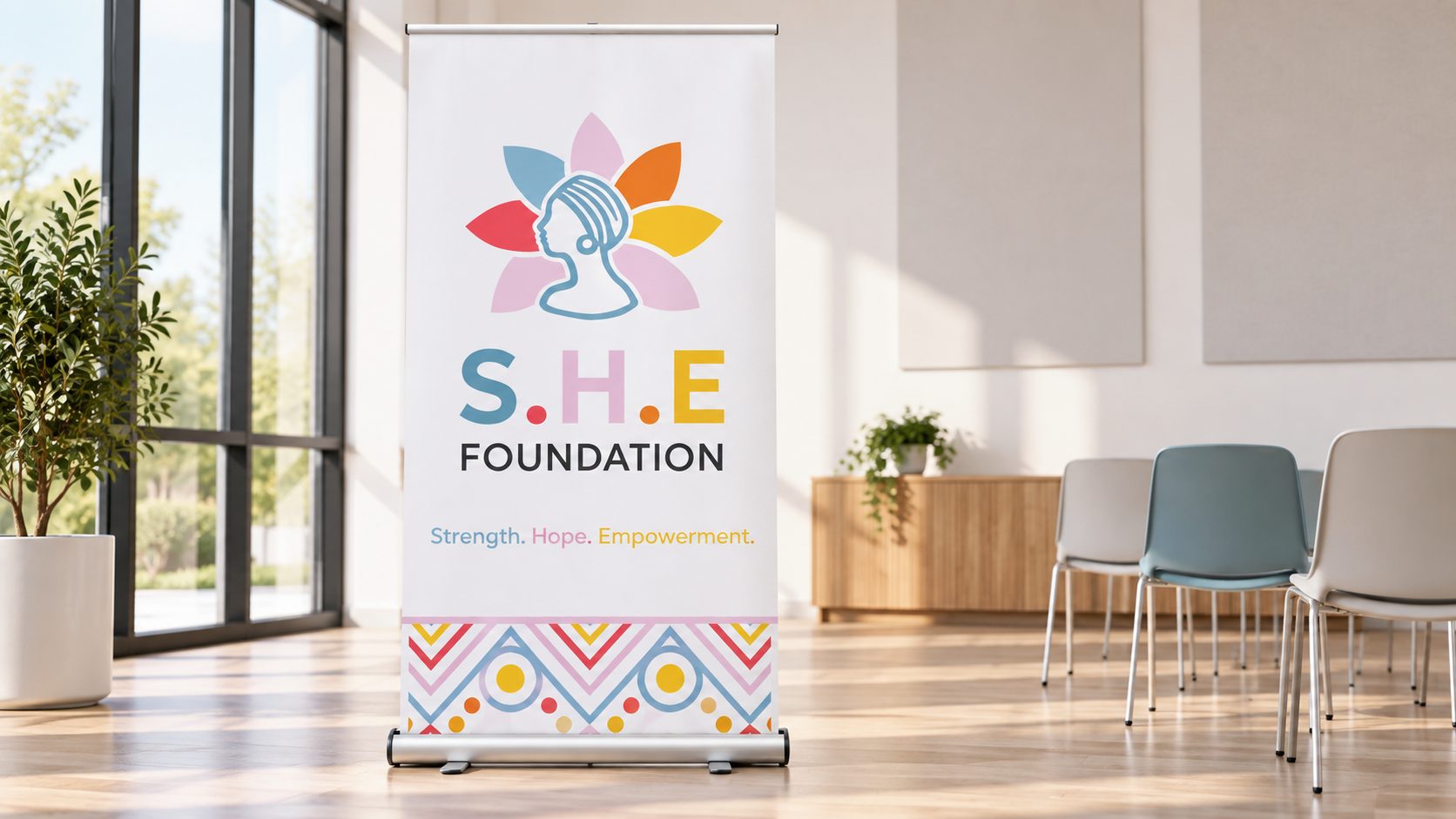
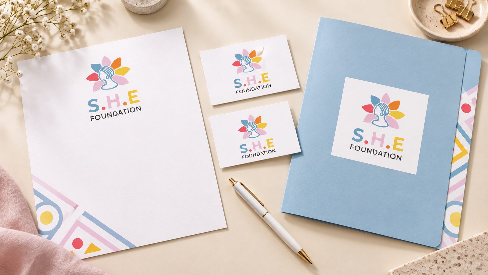
Six concept applications explore how the logo, colour palette and geometric details can extend across merchandise, stationery and an event setting.
These AI-generated mockups illustrate possible brand applications, rather than items or events already produced by the foundation.