Algafusion
The architecture
of escape.
Luxury, local heritage and the natural world — brought together in an identity for a complete tourism experience.
A complete escape.
A connected identity.
Algafusion’s brand rationale describes a 360-degree tourism experience that brings luxury, local heritage and the natural world together. Its promise to international travellers is a carefully crafted “rustic posh” adventure.
The Architecture of Escape gives that promise a clear expression. The identity connects the foundations of a campsite with the elevated experience of exclusive travel.
From foundation
to apex.
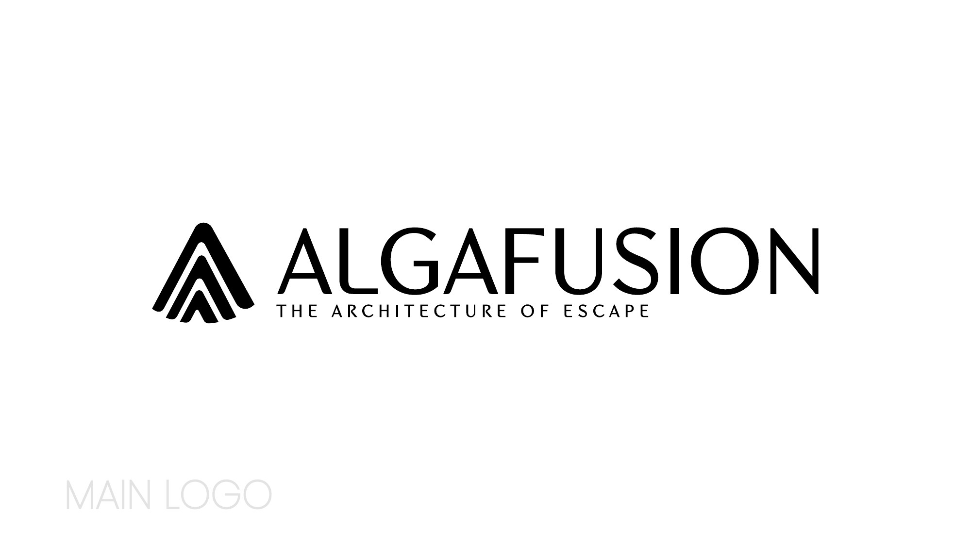
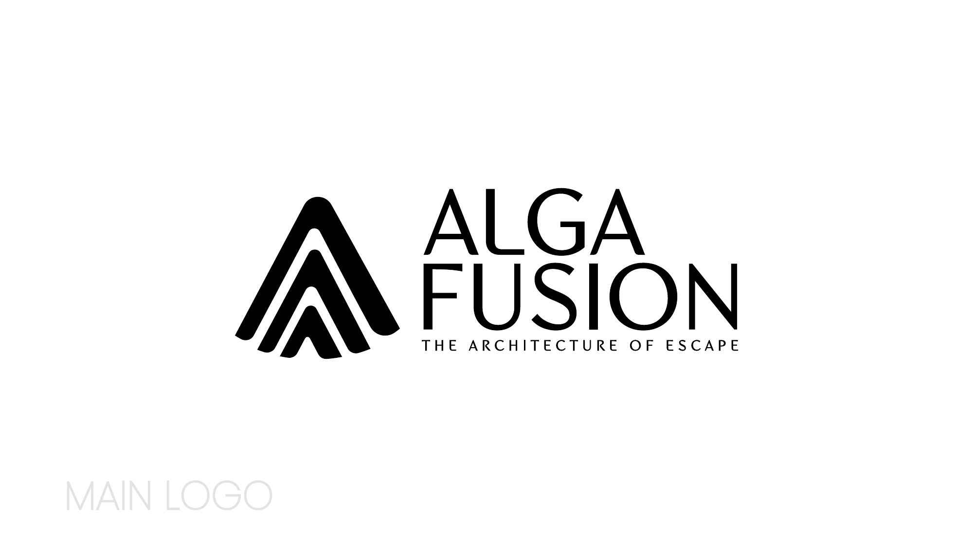
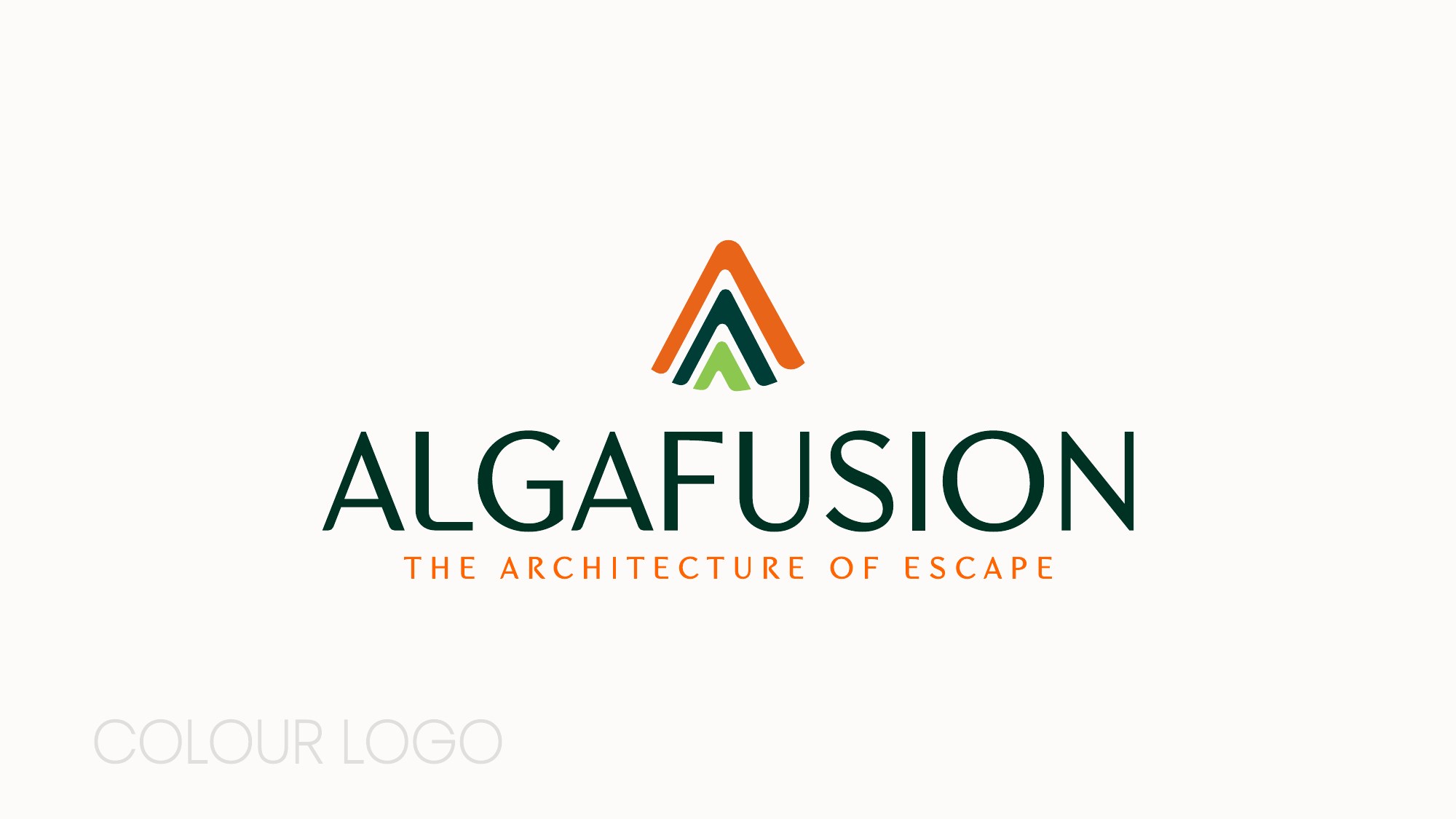
The tiered A icon represents Algafusion’s vertically integrated model: from the physical foundations of its campsites to the apex of exclusive travel. The ascending form gives that idea a recognisable silhouette.
The presentation explores a horizontal wordmark and a compact stacked arrangement. Both pair the emblem with modern typography and the same tagline.
Grounded in nature.
Lifted by orange.
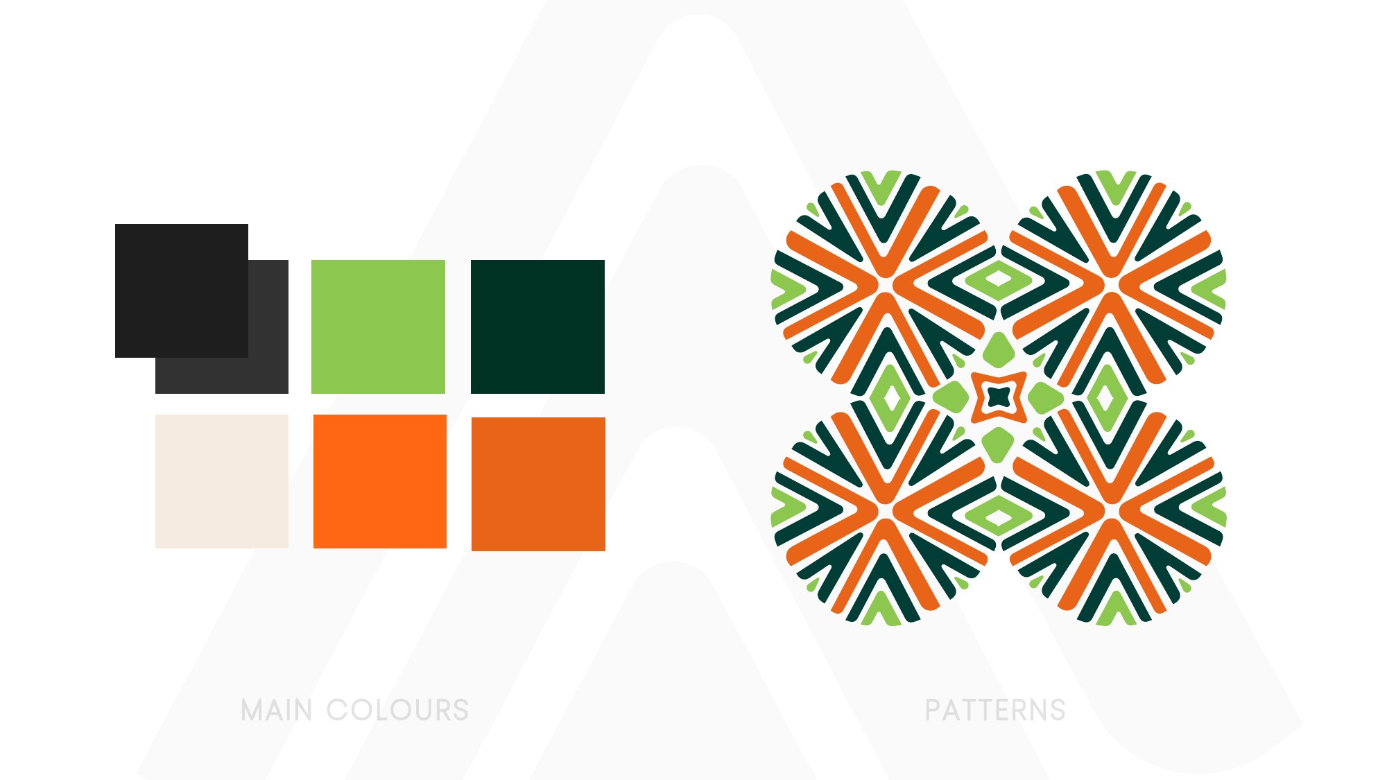
The rationale pairs a Hermès-inspired orange with earthy greens, balancing the luxury positioning with a connection to outdoor landscapes. Cream and dark neutrals give the brighter colours room to stand out.
A repeating geometric pattern carries the palette beyond the logo. Its interlocking shapes bring detail to notebooks, stationery and small branded items.
Small details.
A shared character.
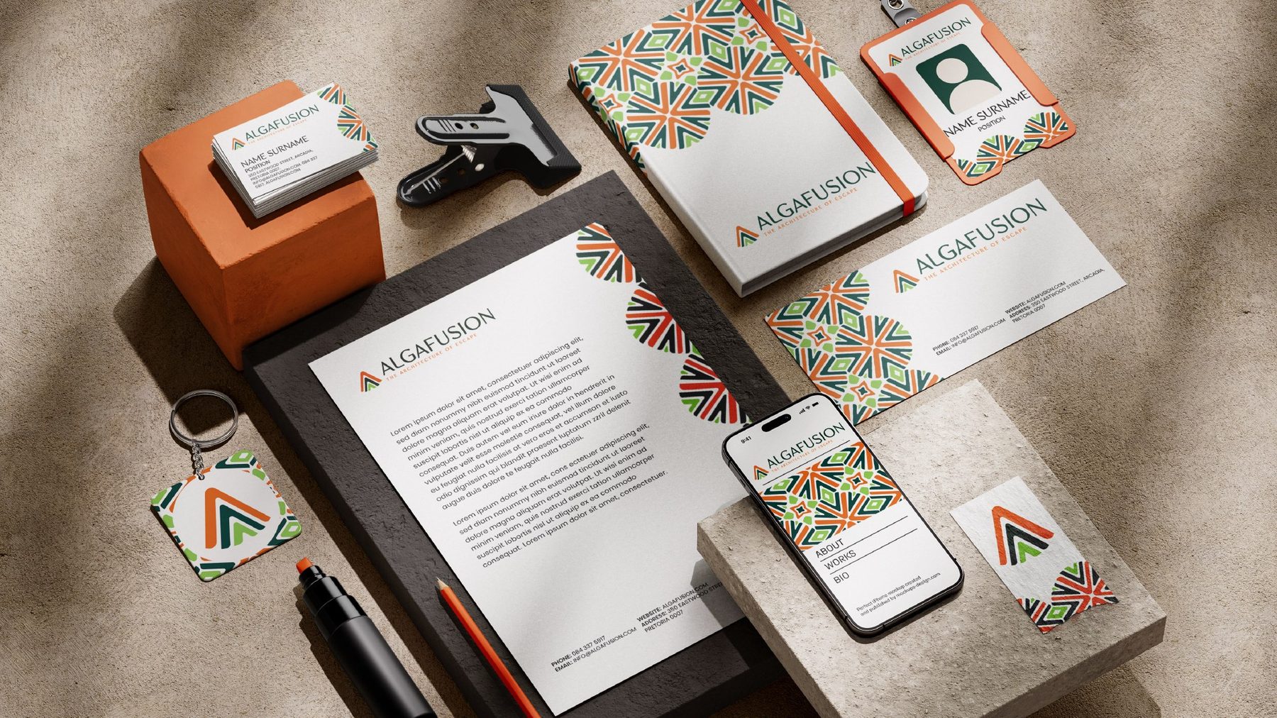
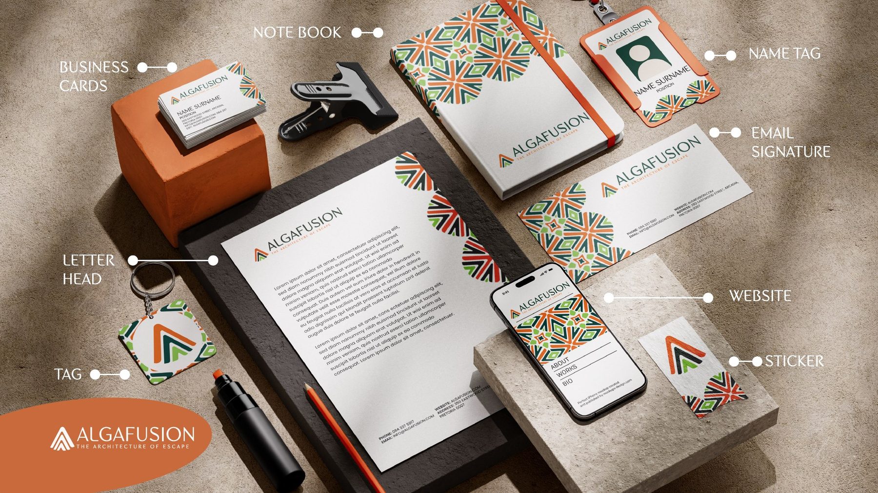
The application board brings the identity into a coordinated stationery and digital concept: business cards, a letterhead, notebook, name tag, email signature, tags, stickers and a website preview.
Orange creates a focal point, while the pattern links the different formats. Generous neutral areas keep the logo and written information clear.
These are presentation mockups illustrating possible brand applications. They do not establish that stationery was produced or a website was built or launched.
From the first arrival
to the next adventure.
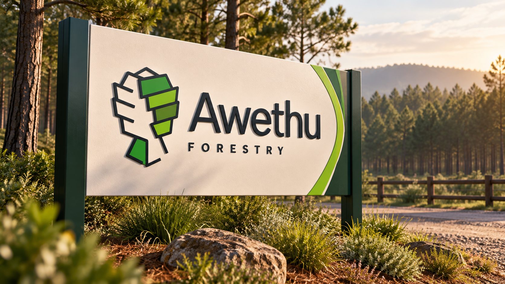
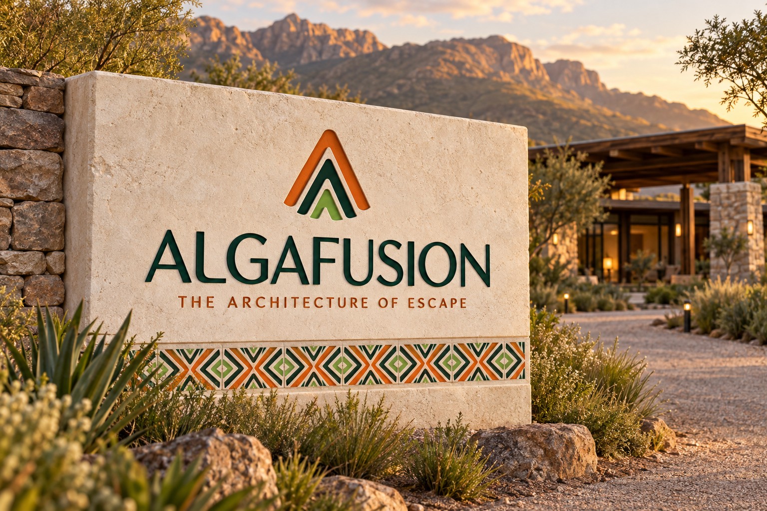
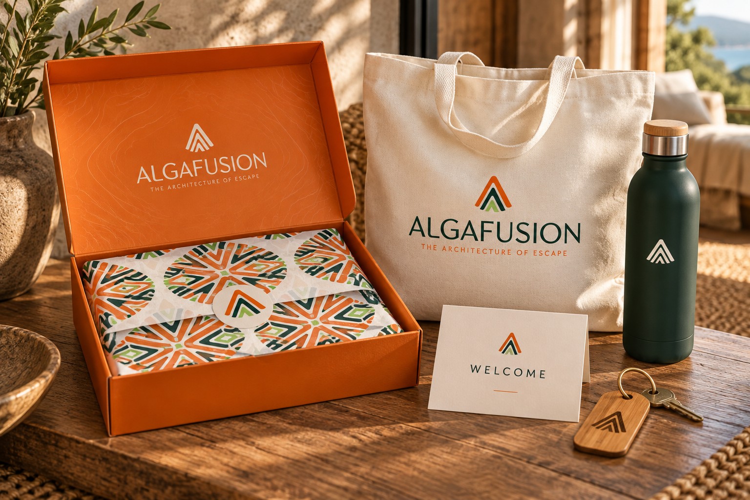
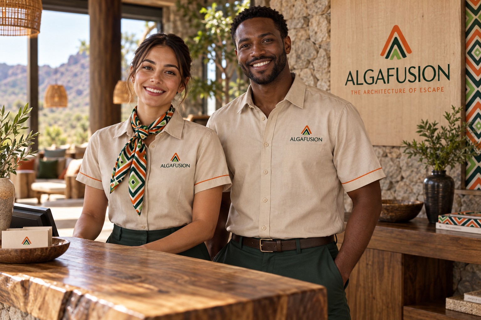
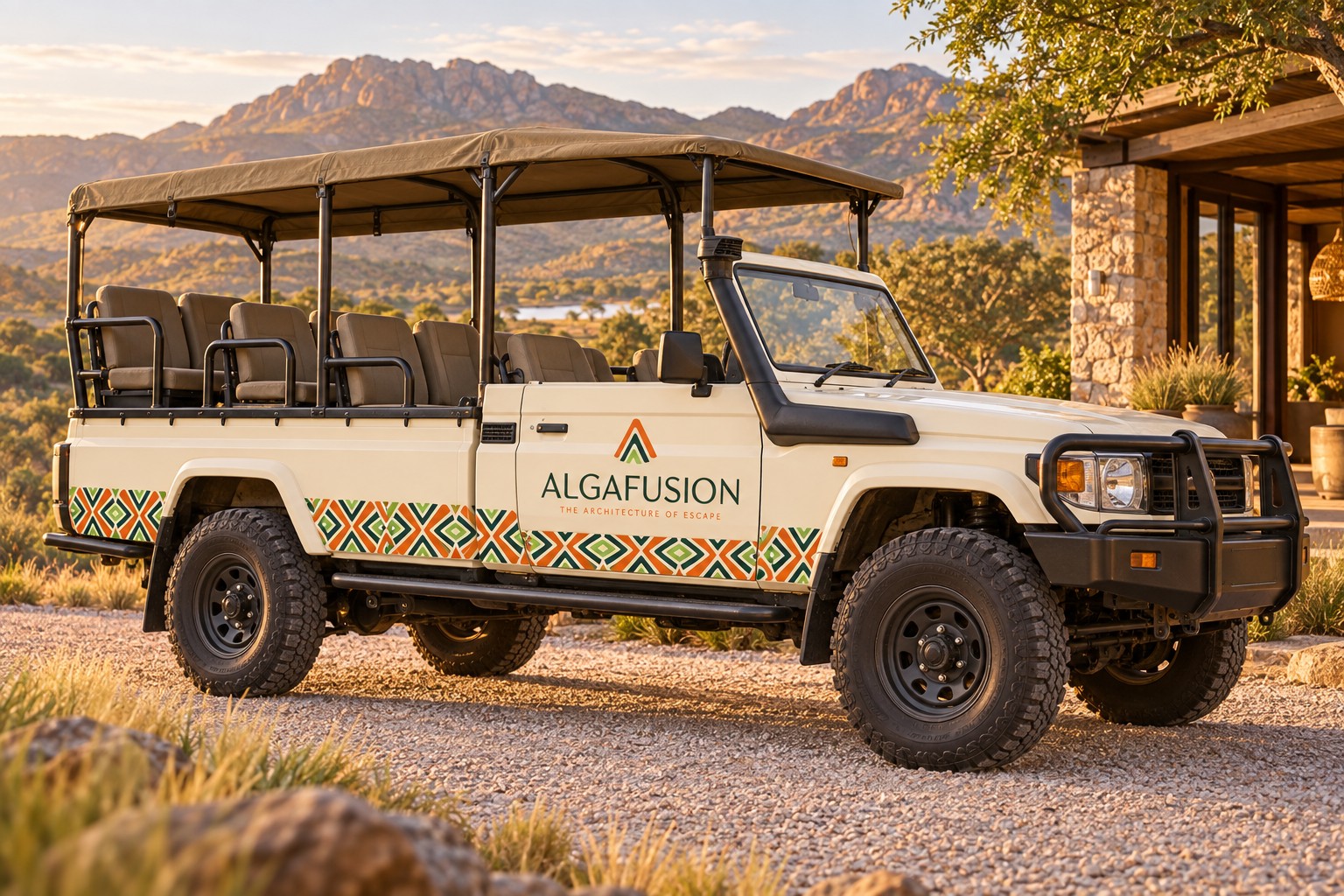
Four application concepts explore how the identity could carry through a guest’s stay: a lodge entrance sign, a welcome kit, staff uniforms and a safari touring vehicle.
Stone, cotton and timber keep the setting grounded. Orange and green give the emblem a clear presence, while the geometric pattern connects packaging, fabric and vehicle details.
These four mockups were created with AI to illustrate possible brand applications. The people, locations, products and vehicle are concepts, not documentation of Algafusion staff, properties or a completed rollout.
An invitation
to step away.
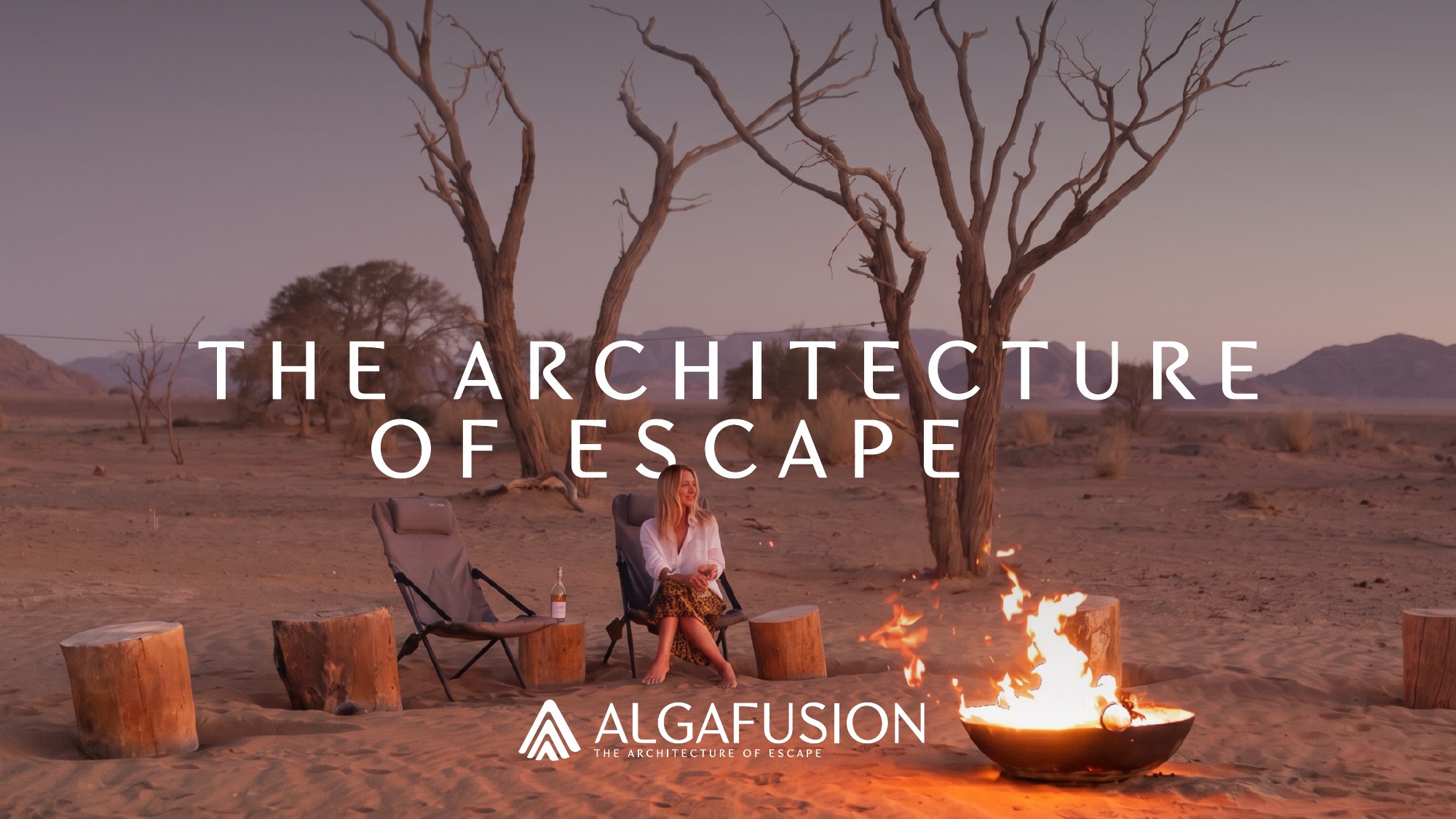
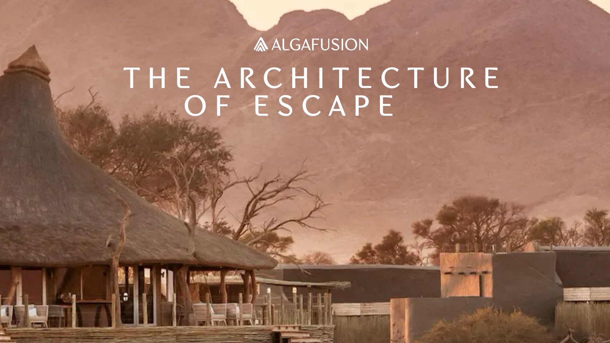
The landscape compositions place the identity alongside a mountain lodge and an open-air campfire. Warm light and spacious imagery give The Architecture of Escape an atmospheric setting.
Together, the mark, palette and pattern create a consistent visual language across the presentation — from a small tag to a full landscape composition.
The landscape images are brand-presentation artwork, not documentation of properties operated by Algafusion.